
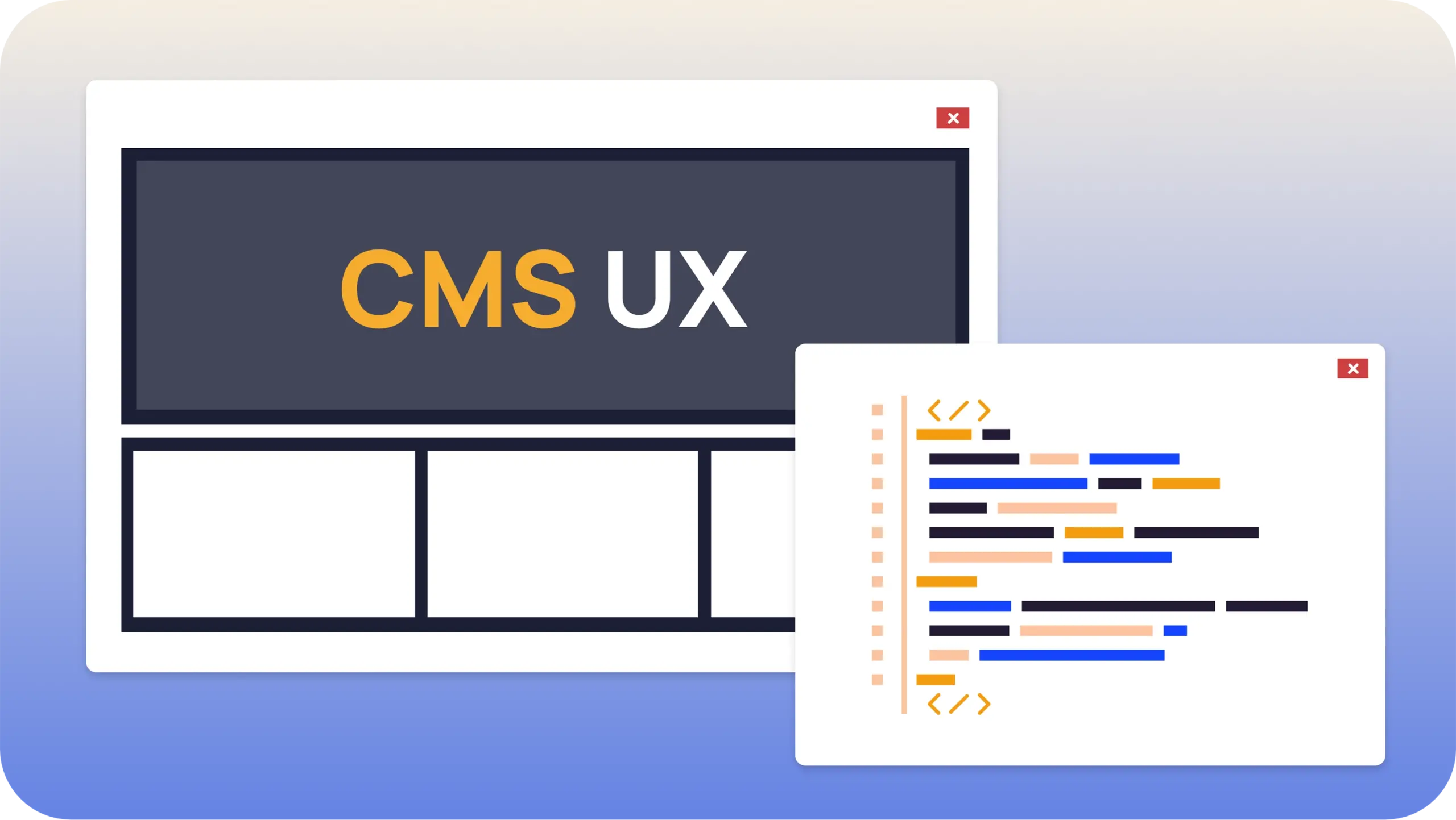
Modern content management systems (CMS) are powerful, but they often fall short in one critical area: usability for content editors. Editors—those responsible for creating, updating, and publishing content—often struggle with overly technical interfaces, fragmented workflows, and lack of intuitive controls.
In this post, we’ll explore:
Why CMS usability is so tough
Common pitfalls in CMS design
Real-world examples and code illustrating better UX
Strategies to improve the editor experience
1. Why CMS Usability Is Tough
a. Content Editors Aren’t Developers
Most CMS tools are built with flexibility for developers in mind. Editors, however, are focused on storytelling, marketing, and communication—not markup, components, or nested field structures.
Example Pain Point:
Editors have to navigate through deeply nested forms just to update a blog title or meta description.
b. Overly Abstracted Interfaces
To support custom components, many CMSs use abstraction layers like "blocks" or "modules." While these offer flexibility, they can feel foreign or overwhelming to non-technical users.
2. Common Usability Pitfalls in CMS
| Problem | Description |
|---|---|
| Complex Field Structures | JSON-like schemas or "field groups" that hide meaningful labels. |
| Lack of Preview | Editors can’t see what their content looks like until it’s live or rendered by devs. |
| Poor Media Handling | Uploading, organizing, and inserting images or video is frustrating. |
| Disconnected Workflows | Content staging, approval, and publishing processes are not seamless. |
3. Improving CMS UX: What It Could Look Like
Let’s imagine a simple CMS form for a blog post. A poorly designed UI might look like this:
While functional, this doesn't help editors understand how this maps to the real page.
4. Better Approach: Editor-Focused Design
Instead, create a component-based editor interface with visual cues and real-time previews.
Example (React + headless CMS concept):
This creates a tight loop between input and visual feedback—a key to good UX.
5. What Makes a CMS UX Truly Great?
Real-time preview: Editors see how content will look before publishing.
WYSIWYG editing: Rich text that feels like writing in Google Docs.
Inline media tools: Drag-and-drop images, crop tools, alt-text prompts.
Clear workflows: Approval flows, versioning, and publishing should be obvious.
Contextual help: Tooltips, hints, and accessible documentation.
Conclusion
CMS usability remains a challenge because most systems are not designed with editors as the primary user. By shifting toward more visual, feedback-driven interfaces and simplifying workflows, teams can empower editors to focus on what they do best: creating great content.
🔧 Bonus Tip:
If you're building or choosing a CMS, involve actual content editors in the evaluation process. Their input will uncover usability issues that devs might miss.
Recent Blogs

The essence of open source cannot be denied in present world. Almost all the popular…Read more